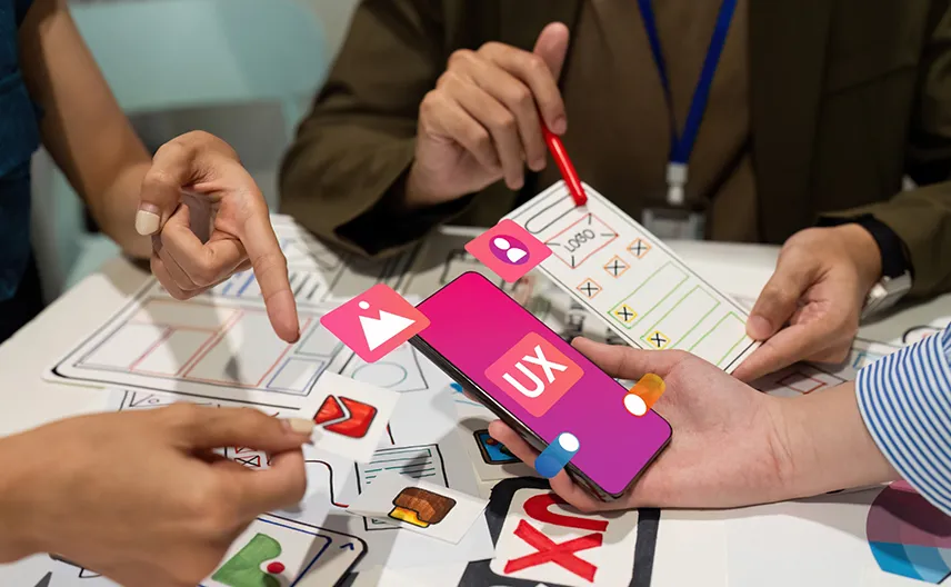
List of Top Web Design Companies | Top Web Designers


 251 to 1000
 $51 - $100 /hr
 Web Designing (UI/UX)
 India, United Arab Emirates
Damco is a US-based technology solutions and IT Services company providing customer-centric services in digital, data, product development, technology outsourcing, and managed engagements. Read More About Damco Solutions
Fishermen Labs
Unlocking the potential of immersive tech. Crafting experiences for meaningful connections & tangible value.
11 to 50
$101 - $150 /hr
Web Designing (UI/UX)
USA
Fishermen Labs is an Immersive Media Agency specializing in the design and development of extended reality (XR - AR, VR, MR) and interactive experiences that drive tangible value for business and meaningful connections between brands and consumers. Unleashing the full potential of spatial computing, our global team of skilled designers, artists, and developers craft creative narratives and experiences powered by emerging technologies. Read More About Fishermen Labs
2 to 10
$51 - $100 /hr
Web Designing (UI/UX)
USA
Softnix is a leading Full Stack Development Agency based in the USA, dedicated to providing comprehensive and customized app, web, and software development services. Our expert team combines technical proficiency with creative innovation to deliver solutions that drive business growth and enhance user experiences. We prioritize quality, scalability, and client satisfaction, ensuring that our solutions align perfectly with your business objectives. Read More About Softnix
Define Your Project Scope Before You Compare Companies
Create a detailed scope of work using AI in minutes. A well-defined scope helps vendors understand your needs better and provide accurate timelines and pricing.
Generate Scope with AITakes less than 2 minutes

11 to 50
$26 - $50 /hr
Web Designing (UI/UX)
Ukraine, USA
We are a European software company with headquarters in Estonia and RnD center in Ukraine. Our expertise lies in building mobile and web apps for startups from Western Europe and the USA. We design, develop, and test our apps internally. This way we can always be sure about the quality of the end product. Read More About Riseapps

11 to 50
$51 - $100 /hr
Web Designing (UI/UX)
UK, Croatia
TAR combines consulting and development in the AR/VR space to deliver a white-glove experience to our clients. We have created a variety of bespoke Augmented Reality and Virtual Reality experiences for well-known brands such as Microsoft and Ford. Our team can help you design and deliver the perfect innovative experience. Our work has been recognized through the various long-term partnerships we have developed due to our quality work. Read More About Takeaway Reality
11 to 50
< $25 /hr
Web Designing (UI/UX)
India, Canada
Virtual Coders is a rising digital transformation firm from India, offering advanced Custom software development services to clients globally, driving increased revenue. Boasting a skilled team of over 40 professionals, we excel in comprehensive technology development and support. Our primary services encompass complex enterprise system construction, custom and mobile app development, seamless migrations, and integration, while also focusing on secure maintenance for large-scale applications. Read More About Virtual Coders
2 to 10
< $25 /hr
Web Designing (UI/UX)
USA
Unbench is a unique platform that links tech companies with top development teams from all over the world. We help businesses grow by finding them expert developers who can start right away. With our network of tech contractors, Unbench makes it easy for companies to quickly fill important roles in their projects. This means projects can move faster and cost less, without losing out on quality. Read More About Unbench
11 to 50
< $25 /hr
Web Designing (UI/UX)
India
Lucenta Solutions is a leading technology solutions service provider, driven by innovation and a dynamic technical prowess. Passionate about delivering tangible results, we excel in providing cutting-edge, customized business solutions tailored to our clients' needs. Read More About Lucenta Solutions
11 to 50
$26 - $50 /hr
Web Designing (UI/UX)
India
We are an offshore software development agency focused on helping businesses grow with modern technology. Our team specializes in building custom Web and Mobile Applications, optimizing infrastructure through DevOps, developing AI-powered solutions, and leveraging Blockchain technology. With expertise in popular tools like Node.js, React.js, and Python, we create tailored, user-friendly products. We deliver high-quality solutions that meet your business needs from design to deployment. Read More About Code B Solutions
51 to 250
< $25 /hr
Web Designing (UI/UX)
India
eQuadriga Software is a premier software outsourcing and offshore development firm with over two decades of industry experience, providing tailored solutions that drive business growth across various industries. Read More About eQuadriga Software
51 to 250
$26 - $50 /hr
Web Designing (UI/UX)
India, USA
With a wealth of experience spanning over 15 years, serving 2K+ clients in more than 20 countries, and boasting a team of 110+ experts we specialize in streamlining, optimizing, and automating business processes. We are here to resolve all your software development needs. Read More About Techinfini Solutions pvt ltd
51 to 250
$101 - $150 /hr
Web Designing (UI/UX)
USA
Tech.us provides full-stack software development teams for your business. Top companies hire Tech.us to successfully complete their software projects on-time and on-budget. Contact us today to get started in building great technology. Read More About Tech.us, Inc
10,000+
$26 - $50 /hr
Web Designing (UI/UX)
We are a reliable partner in Digital Engineering and Enterprise Modernization. Our team combines extensive technical expertise with industry experience to assist our clients in predicting what is coming next and finding answers to potential questions. Our proven solutions and services provide a distinctive competitive edge for our clients by enabling them to gain a broader perspective and surpass their competitors. Read More About Persistent Systems
Need assistance in finding the best match for you requirements?
Let Our AI Algorithm Connect You with Top Industry Experts.
Get Your AI-Powered Shortlist
51 to 250
$26 - $50 /hr
Web Designing (UI/UX)
USA, Singapore
BR Softech is a leading game development company. Established in 2012, our cutting-edge game development solutions like Web3, HTML5, Cross-platform, blockchain, AR/VR, Metaverse, fantasy sports, poker, slots, and online game development services have benefited a plethora of businesses. Read More About BR Softech Pvt Ltd
2 to 10
< $25 /hr
Web Designing (UI/UX)
India
Welcome to Idhyha Creatives & Technology, where creativity meets technology in the most interactive and fun way possible! We're a vibrant Creative & Tech agency dedicated to crafting highly engaging designs paired with in-depth UX research. At Idhyha Creatives & Technology, we understand the value of time in business, which is why we've revolutionized our process with ready-made kits infused with AI design. Read More About Idhyha Creatives and Technology
Can’t find the right partner for your project?
Get a list of top companies, handpicked by our AI to match your requirements.
Get a Personalized Shortlist
Research & Surveys
Explore the Latest News, Tips, and Advice for Your Business Success.


What are the best practices of building responsive web design?
These are some of the best practices of building responsive web design.
- Easy to find CTA: A CTA (or call-to-action) is a vital part of any successful website. Oftentimes, companies rely on CTAs to encourage users to click into their pages or sign up for a newsletter, and many other similar things! While the design and placement of a CTA can differ depending on its purpose, one thing remains certain; a well-designed CTA draws attention more effectively than an unreasonably placed one does.
- Use SVG & responsive images: Designing logos and images for your website can be time-consuming. You might want to have a high-resolution image for your site that doesn't pixelate when the user zooms in. However, those images can come at a cost of increased loading time.
For SEO purposes, your website should have a loading time of less than 2 seconds. You can use a smaller image of less resolution, but that might pixelate when the viewer zooms in. So, what's the solution for this problem?
The answer is scalable vector graphics - SVG images. - Dimensions of buttons: The most important question of responsive web design is – how big should I make a button? For mobile and tablets, the buttons should be large enough to tap with the fingers.
Research on button spacing and sizing found that users faced the lowest accuracy on less than 42 pixels. Buttons that are larger than 72 pixels also had quite a low accuracy. The most preferred button size was found to be 60 pixels. And the optimum range of button sizes lies between 42 and 72 pixels. - Use of lightweight frameworks: There are many different web design frameworks available, but Bootstrap is one of the most popular due to its wide range of responsive elements. However, Bootstrap can be quite slow to load due to its large size. This can be a major downside for website visitors.
These are some of the lightweight CSS frameworks that can help us with responsive web design:
- UIKIT
- BULMA CSS
- Mini.CSS
- Skeleton
- HiQ - Cross browser testing: Cross Browser Testing is a type of testing to verify if an application works across different browsers as expected and degrades gracefully. It is the process of verifying your application’s compatibility with different browsers.
 Top Web Design Companies in Australia in June, 2026

